Idea Brand Refresh
Idea is Northeastern University’s student-run venture accelerator. Idea’s brand identity hadn’t been updated since the organization’s founding in 2009, and it was showing its age. I led a team that produced a simplified, more cohesive identity that stayed true to the core of the original brand.
Branding, Graphic Design
One
Brand Elements
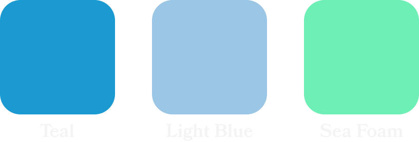
We started by taking a fresh look at the core elements of the IDEA brand. We selected the pieces that were still working and added new complementary pieces. We trimmed the colors down to the existing shades of blue, and added a new Sea Foam shade. We chose Plus Jakarta sans typography for its simple geometric shapes and matched it with Hepta Slab in medium for complementary serif. We also trimmed down the pattern selection and added variants of a new pattern based on the Idea logo.
Primary Colors

Secondary Colors
Typography

Patterns

Two
Updated Logo
Using our updated branding elements, we reworked the logo with new typography. We also added a new “Frame” variant, designed to give the logo a more distinctive shape when standing on its own.
Updated Logo


Bulb Logo

Frame Logo

Three
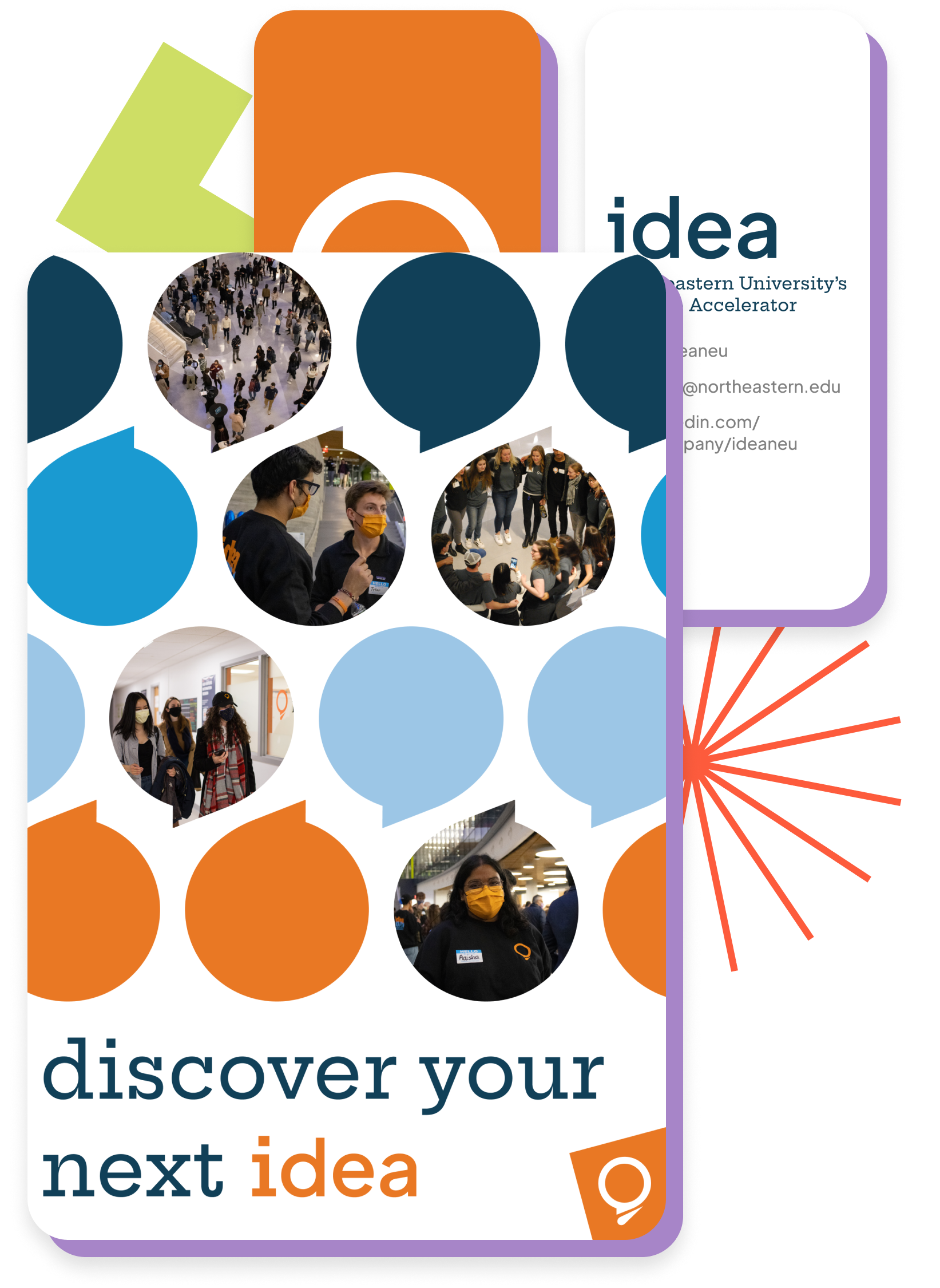
Brand in Use
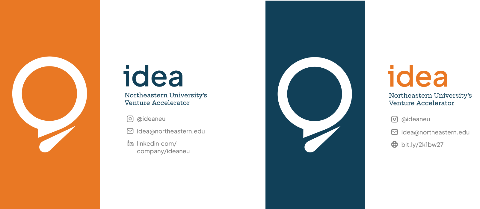
Personal Business Cards
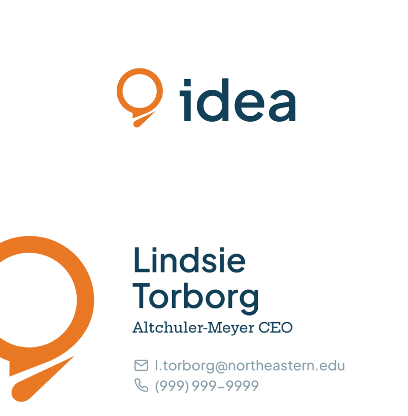
Investor & Venture oriented business cards
Posters

Four
NEXPO
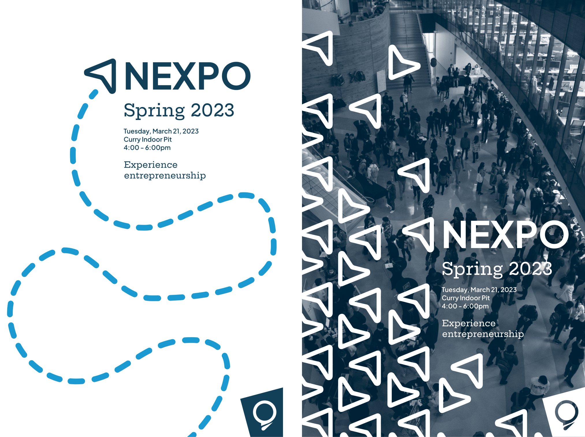
NEXPO, Idea’s annual venture showcase, exists as a sub-brand of the main Idea brand. As part of the brand refresh we simplified the NEXPO brand and brought it in line with the main brand guidelines.
Logo

Colors

Pattern

Event Posters
Instagram Explainer Post

Instagram Story Event Countdown

Five
Pitchfest
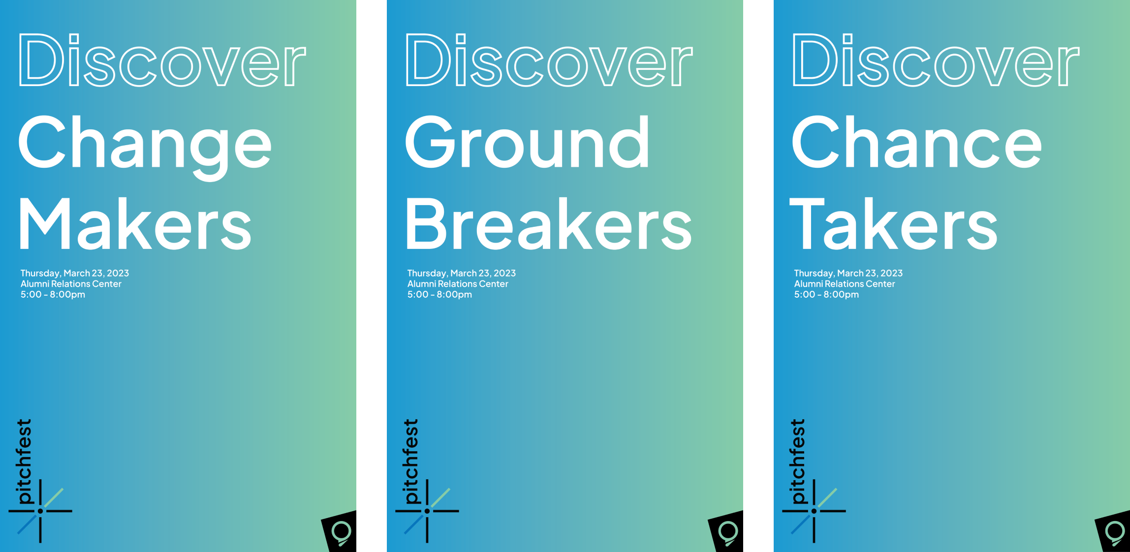
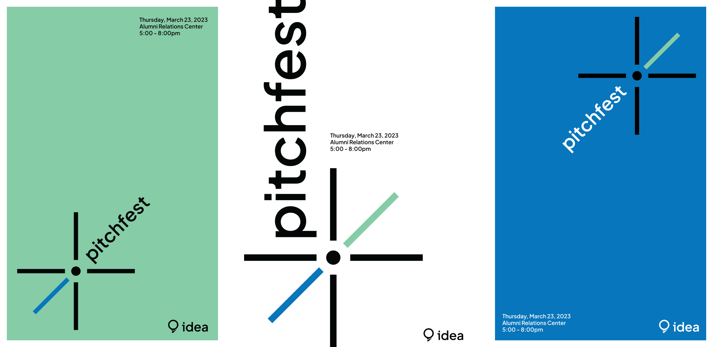
Pitchfest is a new event where ventures can present their product and vision to a panel of potential investors. For the brand refresh we completely relaunched the event, complete with new name, logo, and colors.
Colors & Gradient

Logo
Logo Animation
Event Poster Sets

© 2026 Paul Korfhage